Graphics and Design
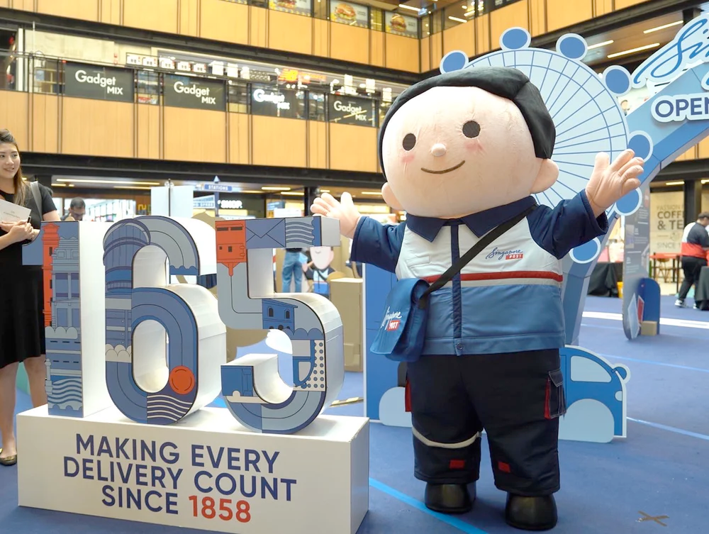
One of the first things to catch a visitor’s eye is the design of your booth. Compelling imagery, the right colours, bold messaging, consistent visual elements that align with your brand not only communicates the essence of your brand but also creates a lasting impression. On the other hand, blurry and distorted images, poor design and inconsistent visuals, more than damage your brand’s image, they run the risk of steering visitors to the competition.
Investing time and effort in a good exhibition design is worthwhile to ensure that your booth stands out and helps you accomplish your goals for the exhibition.
Interactivity
Good graphics and design can help attract visitors, but to get them to stay requires different strategies no less important than design. Interactivity is one of the best ways that you can engage visitors, leaving them with a lasting impression of your brand long after they leave. Furthermore, interactivity can also be used to convey information effectively. For example, digital interactions through mediums like tablets and touch screen displays allow visitors to explore your services at their own pace. Hands-on experiences like product demos can turn visitors into clients by providing a tangible feel of your product. In a crowded space, an interactive booth can differentiate your brand from the competition.
Effective Use of Space

Suppose you’ve attracted a decent crowd, you’ve engaged them successfully, how do you maintain a pleasant environment that allows you to cater to both new and existing visitors? The answer to that lies in the effective use of space.
The layout of your booth can play a significant role in whether visitors are compelled or discouraged to visit. Poor layouts can cause congestion, preventing your products and services from being properly viewed by visitors. A well thought-out layout facilitates a smooth flow of traffic and makes it easier for staff to engage with visitors.
High-Quality Materials
One subtle, but equally important element of good exhibition design is the strategic use of high-quality materials. The choice of materials enhances the visitor experience, but above all influences brand perception. For example, our brand, Paper Carpenter, specialises in cardboard design. We use specially designed cardboard (Gaia Boards™️) to create exhibition booths, and a variety of other products, including furniture and displays. Brands that have made use of our products are often seen as creative, eco-innovative, sustainable, visionary, and pioneering. Ultimately, it’s best to remember that choice of your materials reflect your brand’s ethos and values.


